Exercise 5 Demo: Part A : Page Design
A Good Website is Well C.R.A.P.H.T.E.D
When I was working on my Masters in Educational Technology, one of the courses I took was Advanced Web-Based Multimedia Development. One night my instructor gave us a lecture explaining how a good website is full of C.R.A.P. This lecture was developed from a chapter in The Non-Designers Web Book by Robin Williams and John Tollett. I thought it was an informative lecture, but I didn’t think it covered the topic well enough, so I added 4 more points. I think a good website should be well C.R.A.P.H.T.E.D. Following are my thoughts on simple but solid web design.
C = Concept & Contrast
Concept:
You must have a well thought out concept in mind before you put together your website - whether you are building it yourself or having someone else build it for you. What is the website for? What are you trying to do with it? Sell a product? Give out information? Be entertaining? Make sure the website you develop will fulfill the purpose you had in mind.
Contrast:
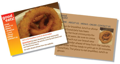
Big and small, light and dark, contrasting colors, make things pop. It you are subtle with your style or give everything on the page the same emphasis, it makes it too hard for your reader/visitor to discern what is important. The same content may be there, but the reader may not find it interesting. A big image and a large headline grabs attention. If it works, they come closer to view the next level of content. And from there, the "fine print". You have an opportunity to catch their attention in a very limited time frame, make the most of it.
R = Repetition
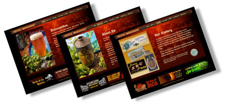
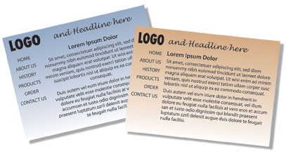
Certain elements need to be on every page. Your logo should be on every page to reinforce your brand. The navigation needs to be in the same location to make it easy to explore your site. Your closing information should always be in the footer. These elements become background. The new page content becomes front and foremost, claiming attention as the visitor navigates from page to page.
A = Alignment
When my students throw up their hands in despair and say things like, I don’t know anything about design, I can’t draw a straight line, I answer them like this. First, there are rulers to use to draw a straight line on a piece of paper, and if you hold the shift key down, you can draw a straight line in most graphical programs. I can’t draw a straight line without them either.
As far as design goes, there are some simple techniques that anyone can follow to easily pull the look of a website together. If you throw the content on the page without planning, it does look messy. Type, aligned to the center, is hard to read and looks unprofessional. Headlines that are all caps look like they are shouting. Reading a paragraph of text that is centered is uncomfortable, especially those last two - five words that are inevitably left at the end. Try aligning the main body text to the left and suddenly the design becomes crisp and clean looking, almost like there is an invisible line drawn along the edge. Text becomes easy to read following our natural E-Reading habit.
Give your images room to breathe by keeping them at least a small distance away from text. Add the
same amount of white space or margin around images so text does not get too close.
Use a grid to break up your information. The most simple grid is a three column one. Content can
span more than one column.
 Your banner may go across the whole
page to span all 3 columns. If you have left navigation, it takes one
and the main page content might take 2. Your footer can span the 3
columns again. Simple, clean and crisp.
Your banner may go across the whole
page to span all 3 columns. If you have left navigation, it takes one
and the main page content might take 2. Your footer can span the 3
columns again. Simple, clean and crisp.
P = Proximity
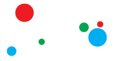
Items that are near each other by nature become a group. Items spread apart become single units. Notice the first three balls. They are definitely separate units. However, place them nearby each other and together they become one unit. You’ve heard the saying, united we stand, divided we fall.
This concept works in page design as well. An image needs to have its caption nearby or be integrated into the text it relates to. A headline needs to be closely followed by supporting text. If everything is evenly spaced, we lose our ability to see how things relate, we lose the flow, and the idea we are trying to express can fall apart.
H = Hierarchy
The content that is most important needs to stand out. It draws the eye immediately. If everything is given the same emphasis, it all blends together. The viewer looks, is unsure where to start and may miss the most important content of the page. Make it easy for them. You decide what is the high point of the page and push it out to them.
T = Typography
Your headlines need to stand out. Use a font that is decorative or a contrast to your sans-serif body text. The small print (body text) needs to be legible. Why use a sans-serif font for your body text? Studies have been done on the best webfont to use as your main text font. Helvetica or Arial are good choices. Make it easy on the eyes. Again, you have but a moment to capture attention, and draw the visitor in to the next level of information.
E = Ease of Use
E Reading/Left Text Alignment
We are E-Readers. We start at the top left and read across, drop down and read across again. Take this to heart. Why do so many websites have their logo on the top left? It’s the first thing we see on the page, great for brand recognition. This is followed by the logo tagline or page headline. Logo... check, we know where we are. Headline... check, we know this page has the content we are looking for.
Navigation
Navigation needs to be visible. Websites for the most part, are not about being tricky (except certain ones for entertainment value). Great locations for your navigation? Right after the logo or banner on the top. Above the banner. Down the left side. Why? Because these areas are always visible on a web page. If the site is too big for the screen, the right side and the bottom may get cut off. Did your navigation just disappear? Will the visitor take the time to find it? Click to information, don’t make me scroll for that.
Drop down menus are very cool, but don’t make the viewer wade through them to find the content they are searching. No more than three levels and really two is enough. If your website is too complex or information heavy, consider adding a site map on the bottom navigation. Break your website up into logical chunks that have inner pages. Not everything needs to be listed on the main nav bar.
How much information should a single page contain? Three scrolls down the page is a lot. If you must have a page that is content rich, give the visitor an additional set of page links so they can jump down the page directly to the information they are looking for, rather than having them miss it while they scroll randomly through. Use document links (jump links). Don’t forget the "Back to Top" link either. If the page is very long, add the "Back to Top" link at a couple of key points. Your visitor will be grateful.
D = Depth of Content
How many pages are needed to hold enough information? One page generally says: website in planning. Five main pages is enough to say we are here. Websites tend to grow with time. Rein them in and be thoughtful about growth. If you are selling something, you don’t have to tell them everything. Whet their curiosity, and make contact! This is where Social Media can enhance your marketing efforts, by giving you an opportunity to create a dialogue with the customer and tell them more. Let there be a call to action to give them an opportunity to connect. Let them fill out a form to get your newsletter, or to ask for more specific product information.
Add your Social Media icons to link to Facebook, Twitter, Google+, your blog and more. Create a circle of information and connection. Don’t be a flash in the website pan that gets forgotten in the long run. One last note - be sure to proof-read your content. Spelling errors are easy to change on a website or blog, less so on some social media where the common experience is write, push ok/send and then notice the typo. Spelling and grammatical errors reflect as poorly on your professional image as bad design does. Find another set of eyes to proof your work. Then push send. Don’t let a typo discount the quality of your product and brand.